Healthy Diet App UI Kit: 29 Templates for a Seamless User Experience
Imagine this: you have a brilliant concept for a mobile application focused on wellness, nutrition, or fitness. You can visualize the user journey, the features, and the value it will bring. Yet, the blank screen of a design tool feels daunting, and the prospect of building every single interface from scratch threatens to stall your momentum before it even begins. This is where a specialized design resource transforms from a convenience into a strategic advantage, allowing you to focus on your unique vision rather than foundational design mechanics.
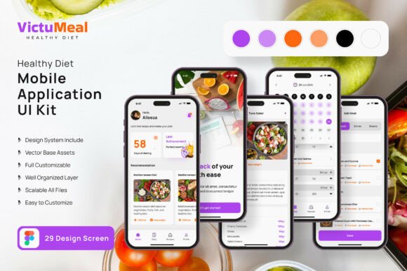
The Healthy Diet Application Mobile UI KIT is precisely such a resource, offering a comprehensive suite of 29 pixel-perfect screen templates and over 80 UI elements. It’s not just a collection of static images; it’s a fully editable framework built in Figma, designed to accelerate the creation of intuitive and visually engaging mobile apps for the health and wellness space. The value lies in its adaptability—whether you’re a designer prototyping for a client, an entrepreneur validating a startup idea, or a marketer creating a companion app for a nutrition brand, this kit provides the architectural blueprint.
From Template to Tailored Experience
The true power of this UI kit is its role as a customizable starting point. You aren’t locked into a single aesthetic. The 100% vector layers, symbol objects, and easy-to-change color styles mean you can infuse the templates with your specific brand identity in minutes. Swap out the color palette to match your logo, adjust typography to reflect your brand’s voice, and modify layouts by adding or removing elements to fit your content strategy. This flexibility is crucial for creating a cohesive brand experience across all touchpoints, from the app itself to your social media graphics and marketing materials.
Consider the practical applications. A small business owner launching a meal planning service can use the templates to quickly mock up a professional-looking app for investor pitches or user testing. A content creator in the fitness niche could design a companion app to offer exclusive workout plans or recipe collections, using the kit’s screens for progress tracking, meal logging, and community features. The included free fonts and icon vectors further streamline the process, ensuring a polished, professional presentation without immediate additional cost.
Building Visual Consistency Across Your Brand
A well-designed application is a direct extension of your brand’s identity. Inconsistent visuals between your website, social media, and mobile app can confuse your audience and dilute your message. This is where a resource like the Healthy Diet Application UI Kit becomes a cornerstone for brand recognition. By using its consistent design language—buttons, cards, navigation bars, and typographic styles—as your foundation, you establish a visual shorthand that users will learn to associate with your brand.
This consistency extends beyond the app. The UI elements can inspire or directly inform the design of other assets. The style of a progress chart in the app could be mirrored in an infographic for your blog. The clean, modern layout of a recipe card template could guide the design of your packaging or print materials. Thinking of the UI kit not just as an app builder, but as a source of scalable design patterns, allows you to build a more integrated and recognizable brand ecosystem.
Practical Considerations for Implementation
When integrating any design asset into your workflow, a few key considerations ensure you maximize its value while respecting its boundaries.
- Customization is Key: Treat the templates as a wireframe with skin. The initial designs are a springboard. Your unique value comes from tailoring the content, imagery, and specific interactions to your project’s goals. Use the fully layered Figma file to dissect how each component is built and then rebuild it to your specifications.
- Font Pairing and Readability: While the kit includes free fonts, your brand may already have established typography. Test your brand’s serif or sans-serif font against the UI elements. Ensure that any font you use, especially for body text and nutritional information, maintains high readability on small mobile screens. Consider hierarchy: a bold display font for headers and a clean, legible typeface for data and instructions.
- Commercial Use and Licensing: This is a critical, often overlooked step. The note that preview images are not included is standard, but you must review the specific license of the UI kit itself. Most premium UI kits are licensed for use in end products, but restrictions can apply to redistributing the source files. Always verify that the license covers your intended use, whether it’s for a client project, a commercial app, or internal prototyping.
- Testing Your Design: A beautiful static mockup is one thing; a functional interface is another. Use Figma’s prototyping features to create clickable flows from the templates. This allows you to test the user journey for features like logging a meal, viewing progress, or navigating to a community forum. This step is invaluable for identifying usability issues before a single line of code is written.
Ultimately, the goal of any design asset is to solve a problem efficiently. For those building in the health and nutrition mobile space, the Healthy Diet Application Mobile UI KIT addresses the significant challenge of starting from a blank canvas. It provides a structured, professional, and highly customizable foundation that respects your time and creative energy, allowing you to channel your efforts into what truly matters: creating a valuable and engaging experience for your users.