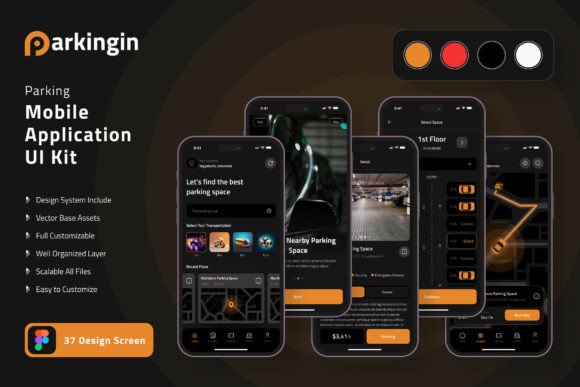
Parking Application Mobile UI KIT: Streamline Your App Design
Imagine you have a brilliant idea for a parking application. You know the features, the user flow, and the problem you want to solve. But when you sit down to design it, the blank canvas feels overwhelming. Starting from scratch means hours spent on basic elements—buttons, navigation bars, map views, payment screens—before you even get to the core functionality. This is where a dedicated design asset like the Parking Application Mobile UI KIT transforms your workflow, offering a polished foundation so you can focus on what makes your app unique.
Beyond a Template: A Foundation for Visual Consistency
At its core, this kit is more than just a collection of screens. It's a comprehensive system designed to establish visual consistency across your entire mobile application. Consistency isn't just about looking good; it's about building brand recognition and creating a seamless user experience. When every button, icon, and typography style follows the same visual language, users intuitively understand how to interact with your app. They don't have to relearn navigation with each new screen, which reduces friction and increases engagement. The kit provides 37 meticulously crafted, pixel-perfect screen designs that cover the essential user journeys of a modern parking app, from searching for a spot to processing a payment and viewing history.
The true power lies in its flexibility. Built entirely with 100% vector layers in Figma, every single element is fully editable. This means you aren't locked into a specific color scheme or layout. Want to adapt the design for a corporate fleet management service? You can easily adjust the color palette to match a corporate brand identity. Are you designing for a university campus parking system? You can swap out icons and modify typography to fit a more institutional feel. The fully layered structure and use of symbol objects mean that changing a core element—like the primary button style—updates it across all 37 screens instantly, saving you countless hours and ensuring your design remains coherent.
Practical Applications for Designers and Entrepreneurs
For a freelance designer or a small agency, this UI kit is a tremendous efficiency tool. When a client approaches you with a parking app concept, you can bypass the initial wireframing and low-fidelity prototyping phases. You can immediately present them with a high-fidelity, interactive prototype based on the kit's templates. This not only impresses clients but also allows for faster feedback cycles. You can focus your creative energy on the unique aspects of the client's brand—integrating their specific logo design, refining the typography to match their voice, and customizing the UI elements to reflect their personality.
For entrepreneurs and startup founders, the value is even more direct. You don't need to hire a full design team from day one. With this kit, you can create a professional, investor-ready prototype to secure funding or attract early adopters. The 80+ UI elements included—buttons, cards, toggles, input fields, and more—give you a robust library to build upon. You can design the core user flow for your minimum viable product (MVP) with confidence, knowing the interface will look and feel professional. This allows you to test your concept in the market quickly, gather user feedback, and iterate without being held back by design bottlenecks.
Even if you're not building a full-fledged parking app, the components have cross-industry utility. The map integration screens, calendar booking interfaces, and payment gateway templates can be repurposed for other mobile applications in logistics, event booking, or service scheduling. The clean, modern aesthetic of the designs makes them adaptable for various digital products, serving as a solid starting point for any application that requires location-based services, time-slot reservations, or secure transactions.
Key Features That Empower Your Design Process
Let's break down what makes this particular design asset so effective for creating a professional presentation.
- Pixel-Perfect Precision: The 37 screen designs are crafted with attention to detail, ensuring your prototype looks crisp on any device. This precision is crucial for building user trust; a sloppy interface can undermine confidence in your service.
- Scalable Vectors: Because everything is built with vectors, you can scale any element—from a small icon to a full screen—to any resolution without losing quality. This is essential for designing across different phone sizes and for future-proofing your assets.
- Customization is Key: The kit is designed for you to make it your own. You can easily change the color style globally to match a brand palette. The inclusion of free fonts and icon vectors means you have a ready-made typographic and iconographic system to start with, which you can then replace with your chosen premium font or custom icons if needed.
- Figma Native: Being available for Figma means it's built for collaboration. You can share the file with team members, developers, or clients for real-time feedback. The use of components and auto-layout (where applicable) makes the design system intelligent and easy to modify.
This structured approach to design helps improve readability and audience engagement. A well-organized interface guides the user's eye naturally from one task to the next. The kit's templates are designed with clear visual hierarchies, using size, color, and spacing to emphasize primary actions like "Find Parking" or "Pay Now." This thoughtful layout reduces cognitive load, making the app feel intuitive and easy to use from the very first launch.
Making It Your Own: From Template to Brand Identity
The journey from using a UI kit to creating a unique brand experience is all about customization. Start by defining your brand's color palette. If the kit's default colors don't fit, use Figma's color styles to update them across the entire project in minutes. Next, consider typography. While the kit includes free fonts, you might want to integrate a specific sans-serif font for a clean, techy feel or a more distinctive display font for headlines to add personality. Ensure your chosen typeface is highly readable on small mobile screens—test it at various sizes within the app's interface.
Icons are another powerful branding lever. The provided vector icons are a great starting point, but you can replace them with a custom icon set that better reflects your brand's style—whether that's minimalist, rounded, or illustrative. Pay attention to the smaller details: the shape of buttons, the style of input fields, and the animations you plan to add later. These micro-interactions, though not included in the static templates, are where you can truly bring the design to life and create a memorable user experience.
Remember, the goal isn't to use the kit as a finished product, but as a sophisticated scaffold. It handles the structural and foundational design work, allowing you to pour your creative energy into the branding, copy, and unique features that will set your parking application apart in a crowded market. By leveraging this comprehensive mobile UI kit, you're not just saving time—you're building upon a foundation of proven design patterns, ensuring your final product is both beautiful and functionally sound.